Show us yer' graphs!

You're on Page 1 of 3
Go to
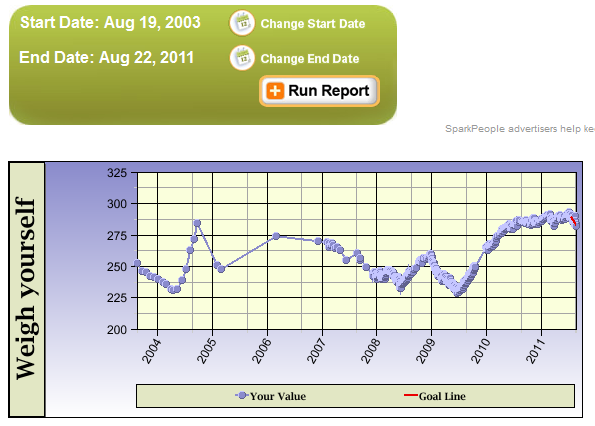
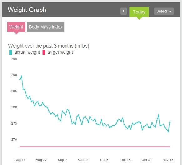
  • Would love to have a look at other people's weight loss graphs (or exercise, or size or whatever it is that you plot really). I'm a scientist so i can relate to graphs! Really they tell a story that you may or may not want telling!!

    Mine looks awful, but i'll display it anyway. (And you might not see it as i think i've shrunk it to too low definition??) This is for the last two years and shows that my current effort looks like it's far too steep a line to be sustainable. Sigh.

    It also shows that over time i'm pretty predictable in that i'll be good for a bit, and lose weight, then stop weighing myself, put on weight, repeat every 6 months, and it's really not clever.

    If i went to my other computer i could probably drag up a graph for 5 or 6 years before this one that will show similar ups and downs in a similar range.

    Another Sigh.


  • I didn't start tracking my weight with this app until July, hence the smooth line before that. To me it shows an incredibly slow downward trend (<1kg/month).

  • I love graphs! Although I'm a teacher. I suppose that makes me another one with a love for a good graph

    Here's mine. I started weighing daily on May 3 at 192 pounds.


  • I love this idea - I posted a thread like this a couple of months ago. Hope you get more takers than I did.

    Here's my current graph. It covers more than 27 months. What I love about it is how it shows so many different aspects of the process. It shows the long-term variances - I can see places where I lost my focus for a while due to other aspects of my life, but still managed to get back on the horse as soon as I could. I can see how the long-term rate of loss is directly correlated to how hard I am working. (The last 3 weeks, for example, show steeper loss than the previous 4 weeks, because I recommitted about 4 weeks ago and have been perfectly on plan that whole time.

    But I can also see the short-term fluctuations that happen regardless of how hard I am working. It helps to see those too, to remember that no matter how big the short-term fluctuations feel when they are happening, they really mean very little in the grand scheme of my weight loss. It helps me keep my perspective and my patience.


  • FUN! I love looking at other people's charts.
    • June 2009 - after rapidly gaining weight over the previous 6-12 months, weight loss/exercise began "for real"
    • December 2009 - Holiday season - bumped right back up to nearly my start weight
    • 2010 - a slow decline (but with nearly 6 months hovering around 140)
    • 2011 - got really close to my "goal" but then bounced up, hovered around a decent maintenance weight of 135 and then..... where I am now, due to really bad habits creeping back in ... bounced up by at least 5 lbs again.
    ARRRRRRRGH. So hard to lose 5-10 lbs. MORE THAN TWO YEARS of trying to lose less than 25 lbs.

  • You can see mine by clicking the link in my signature. I confess to playing around with graphs I've created in a spreadsheet as well.
  • My graph starts when I'm in high school and goes to present (so about 15 years!). I was able to maintain my weight throughout high school and college (with a jump in between). I had a mini-spike when I started grad school and then a major spike during my pregnancy. At first I lost weight post-pregnancy but quickly got into a gaining trend until I started this journey about 1.5 years ago. Hopefully there's going to be a downward trend for awhile still, followed by a long plateau (with a small blimp upward for a future pregnancy or two ).


  • Here ya go! (All graphs/charts from FitDay PC)

    Four month weight goal progress:


    Six month history and 12 week projected weight loss:

    This has slowed down to a complete stop the past two weeks as I approach my goal -- and obviously I have no intention of reaching 96 pounds in February.


    Six month RDA nutritional profile:

    The only nutrient I can't seem to get enough of is Phosphorus. I am thinking about switching from a Calcium/magnesium/vitamin D supplement a phosphorus/calcium supplement. I have too much vitamin D anyway.


    Caloric sources breakdown:

    I am quite satisfied with this profile.
  • I can't see any images in either of the last two posts.
  • I just made some changes to the image!
  • Yep, yours works now. How did you create that graph? Can you edit the x axis so that it just reads from 150 to 200?


  • I made my graph in Excel.
  • My Weight Chart:
  • this one is the the 8 years from august '03 to aug '11

    this one is the last 3 months